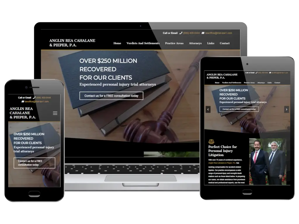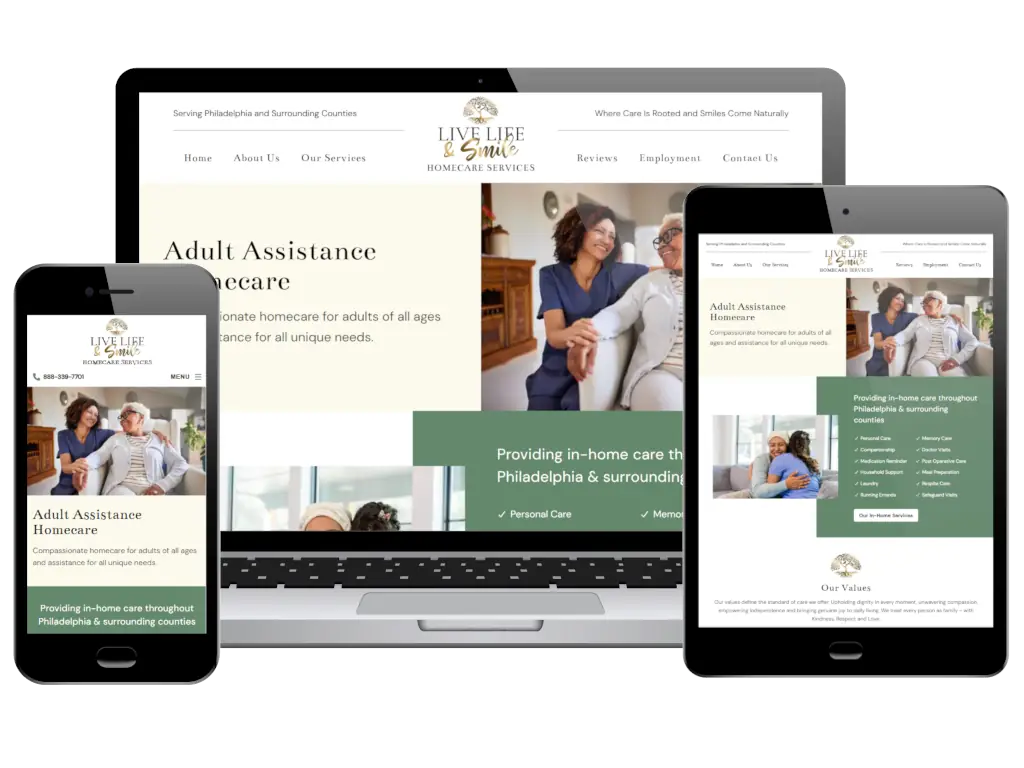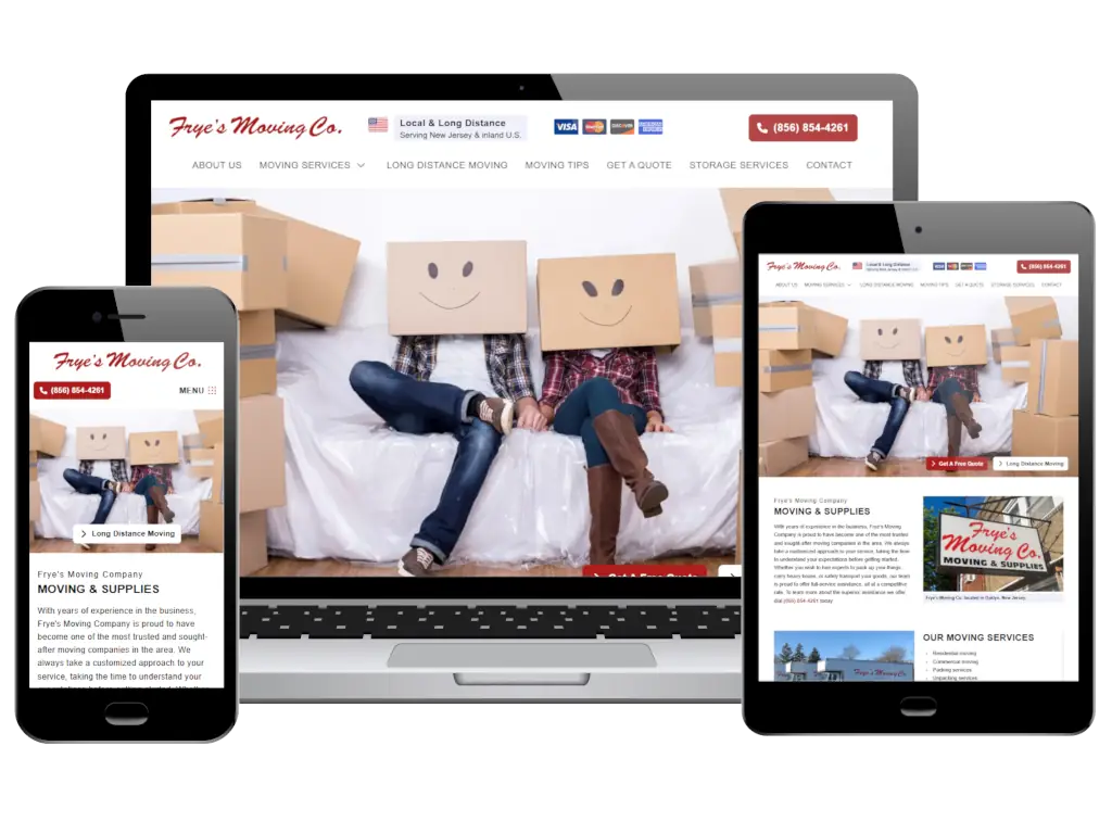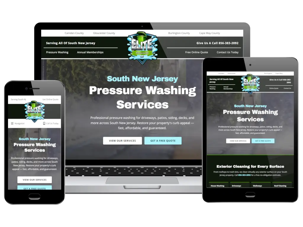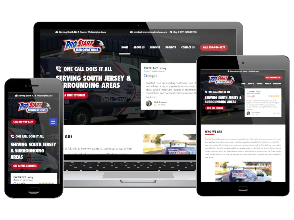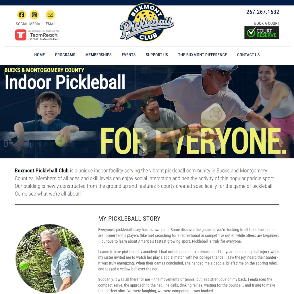
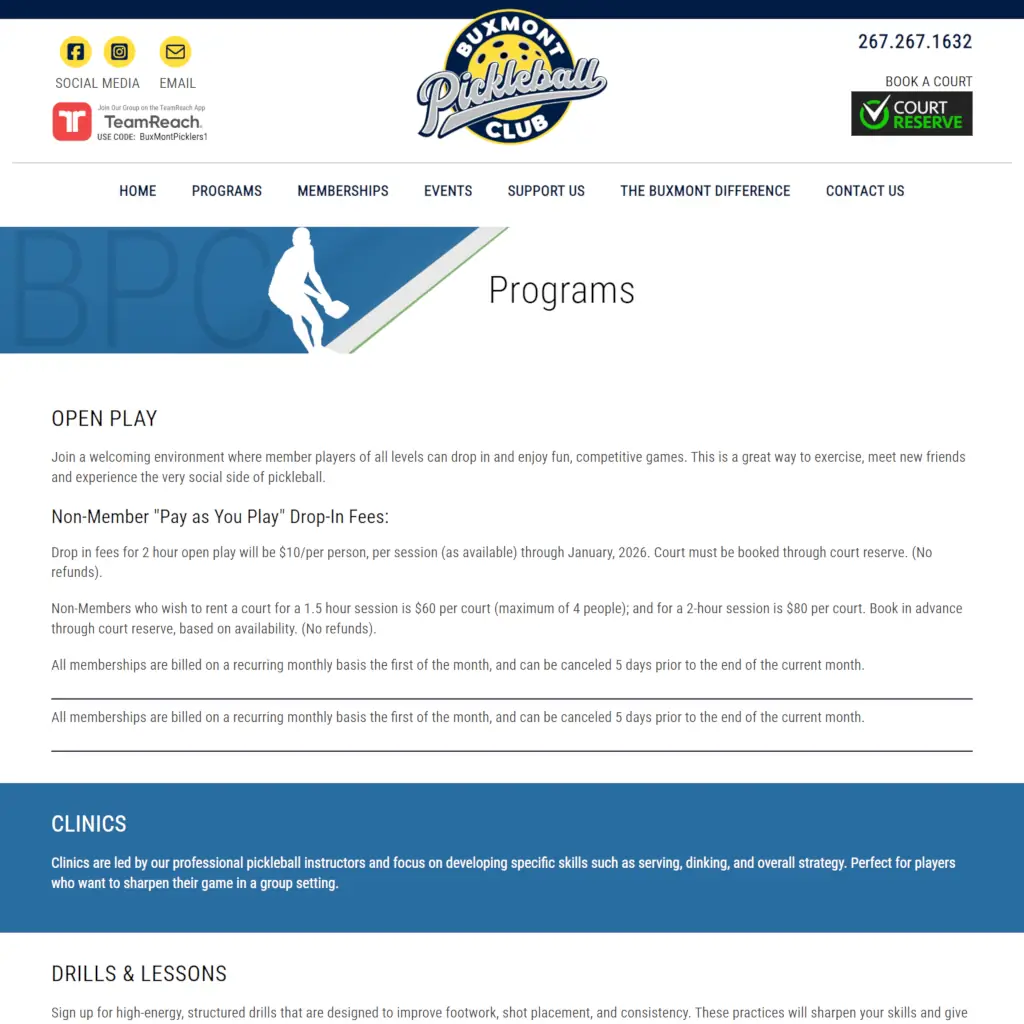
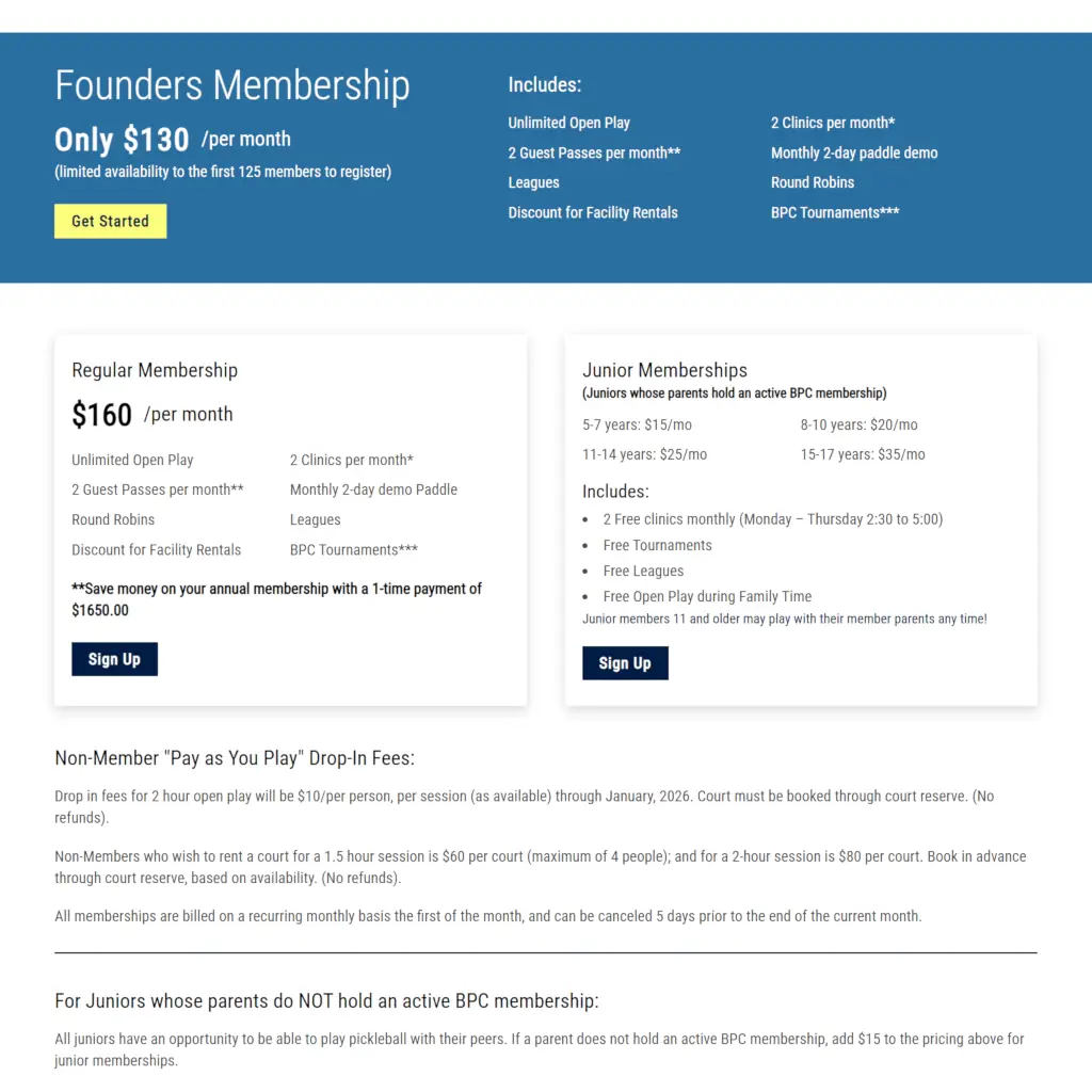
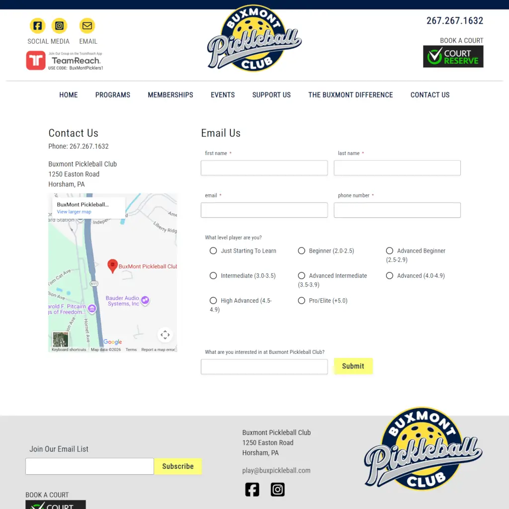
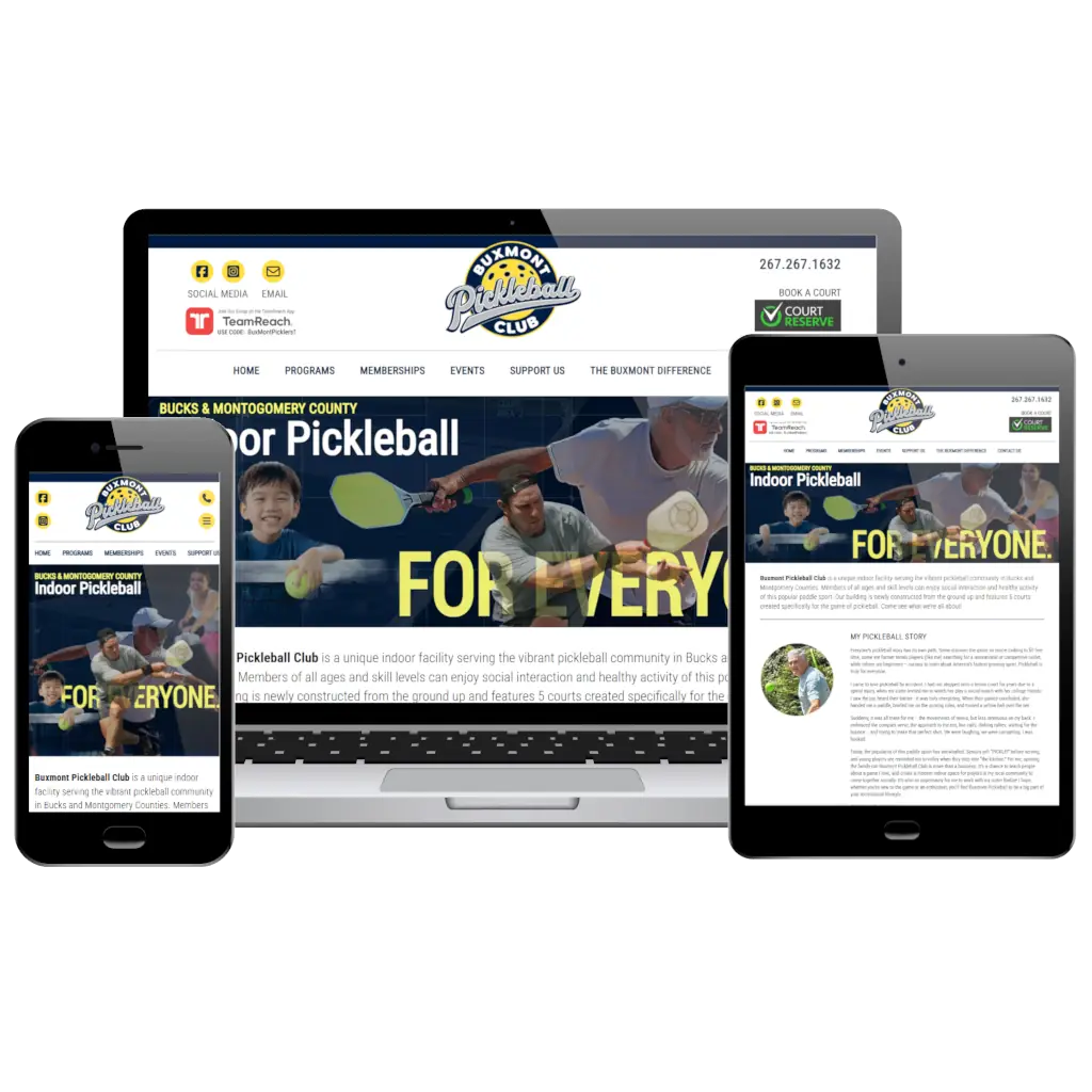
Built Mobile-Friendly From the Ground Up
-
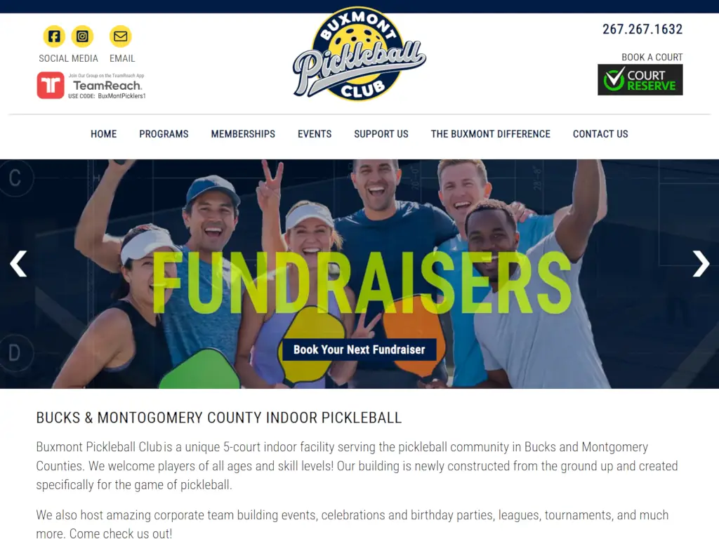
Custom Header
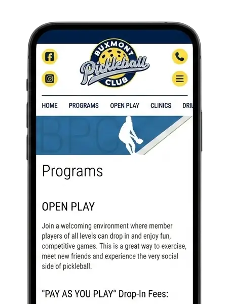
A header built specifically for smaller screens, keeping the logo, menu, and contact info easy to tap without feeling cramped.
-
Horizontal Scrollable Menu
Program and category links scroll left to right in a single row, just like Amazon's mobile menu, instead of wrapping into a cluttered stack.
-
Flyout Menu
Tapping the menu icon slides a full navigation panel in from the side, keeping every page just one tap away.
-
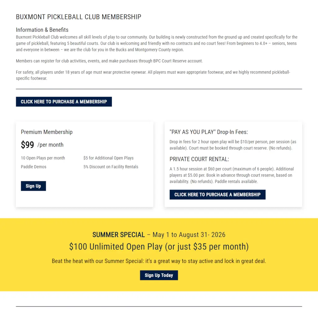
Collapse & Stack Elements
Multi-column layouts automatically stack into a single column on smaller screens, so nothing ever feels squeezed or out of order.
-
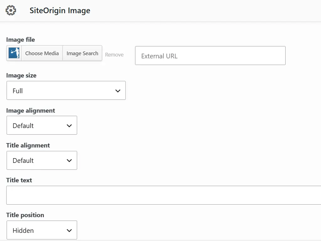
Optimized Images for Mobile
Each image serves a version sized and cropped for the visitor's device, so mobile users aren't downloading oversized desktop images.
-
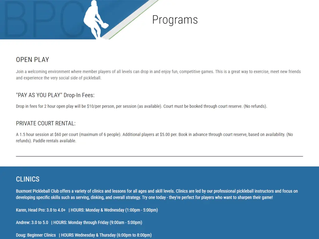
Font Resizing
Text scales down proportionally on smaller screens, keeping headlines and body copy readable without needing to pinch-zoom.